
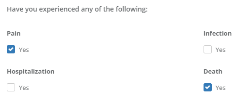
Checkbox: A heading with a checkbox below it that says "Yes" that may be checked if the heading associated with it is true. In the example below, there are 4 separate checkbox fields.
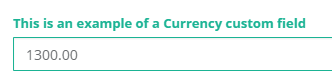
Currency: A numerical input box that allows you to type a currency amount
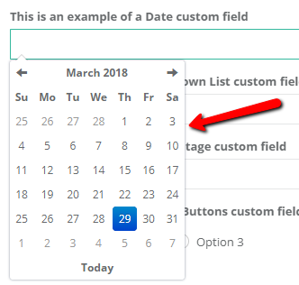
Date: When clicking this input box, you may select an exact date from a calendar that appears.
Note: If you do not require an exact date for the input field, it is suggested that you use Textbox instead to enter more vague dates (ex: "Last Summer" or "March 2017")
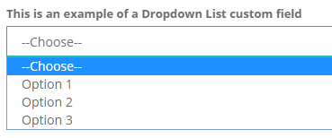
Dropdown List: A dropdown list with multiple customizable options. Only one option may be selected.
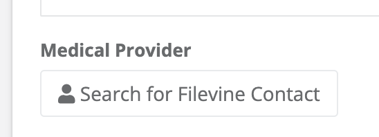
Filevine Contact: A widget that allows you to search for and select a Filevine contact, if integrated.
Link: Allows you to add a link with a customized display name and formatting.

Percentage: A numerical input that allows numbers between 0-100.

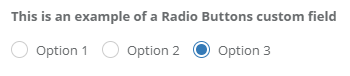
Radio Buttons: A heading with multiple customizable options below with clickable circles. Only one option may be selected.
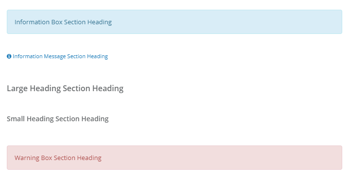
Section Heading: A heading you may put before, after, or in between fields. The different headings and how they appear are listed below.
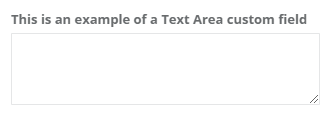
Text Area: A multi-line text area.
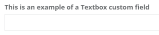
Textbox: A single line text area.
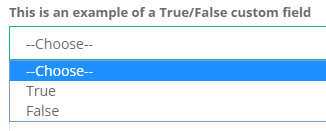
True / False: True or False may be selected from a dropdown list to answer the field.
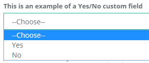
Yes / No: Yes or No may be selected from a dropdown list to answer the field.
Comments
0 comments
Article is closed for comments.